
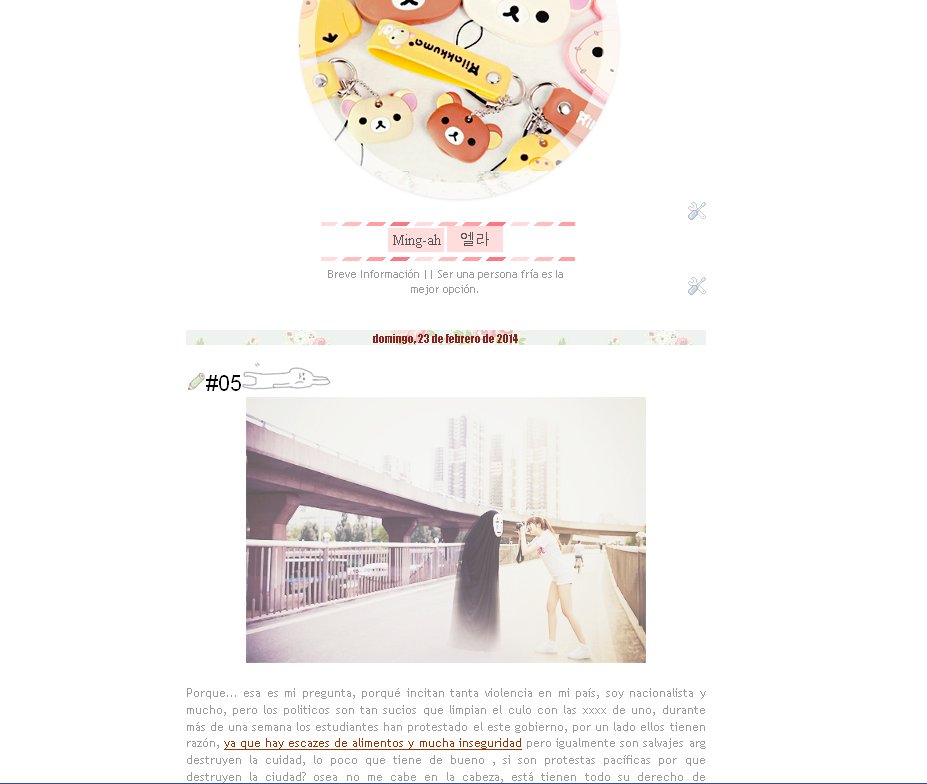
Retomando la ultima entrada sobre editar una plantilla blogger, puedes crear uno propio tanto como paresca uno proveniente de blogskins ^^9 el modelo que veran es uno sencillo blanco .-. pero igualmente será muy lindo, kawaii ^^
Antes
Esta es la primera versión de la categoria #sencillo, como ven está tal cual sin ningún cambio .

Después
Estos son los cambios aplicados ^^ el diseño puede tener un contexto sobre un blog personal, algo que realmente es ^^
 Bien.. ahora, cómo hize el cambio? es facil, empezemos por el diseño, ya sea una columna, 2 o ninguna, en este caso no le agregamos ninguna ^^ y bueno si deseas agregarle 1,2,3 divisiones al piçe de pagina, ya es tu gusto :3
Ahora en la opciçon Avanzado, puedes cambiarles los colores, ya sea en links, letra de la pagina y tambien la fuente de la misma :D y finalmente le das a guardar cambios ^^.
►Editar el contenido general del blog
Te diriges a editar html abres la etiqueta <b:skin>...</b:skin>
-Dentro de la sección :
/* ContentNo hay mucho que editar, realmente eliminas el contenido de la sub-seccion:
----------------------------------------------- */
{Dejando solamente margin-bottom: 1px;}
.content-outer {
-moz-box-shadow: 0 0 $(content.shadow.spread) rgba(0, 0, 0, .15);
-webkit-box-shadow: 0 0 $(content.shadow.spread.webkit) rgba(0, 0, 0, .15);
-goog-ms-box-shadow: 0 0 $(content.shadow.spread.ie) #333333;
box-shadow: 0 0 $(content.shadow.spread) rgba(0, 0, 0, .15);
margin-bottom: 1px;
}
Eso es paja ¬¬, siempre lo elimino porque shadow para mi es sombra :P . Seguimos con la siguiente sección:
Elimina lo subrayado:
/* Header
----------------------------------------------- */
/* Header
----------------------------------------------- */
.header-outer {
background: $(header.background.color) $(header.background.gradient) repeat-x scroll 0 -400px;
_background-image: none;
}
----------------------------------------------- */
.header-outer {
background: $(header.background.color) $(header.background.gradient) repeat-x scroll 0 -400px;
_background-image: none;
}
.Header h1 {
font: $(header.font);
color: $(header.text.color);
text-shadow: $(header.shadow.offset.left) $(header.shadow.offset.top) $(header.shadow.spread) rgba(0, 0, 0, .2);
}
font: $(header.font);
color: $(header.text.color);
text-shadow: $(header.shadow.offset.left) $(header.shadow.offset.top) $(header.shadow.spread) rgba(0, 0, 0, .2);
}
.Header h1 a {
color: $(header.text.color);
}
color: $(header.text.color);
}
.Header .description {
font-size: $(description.text.size);
color: $(description.text.color);
}
font-size: $(description.text.size);
color: $(description.text.color);
}
.header-inner .Header .titlewrapper {
padding: 22px $(header.padding);
}
padding: 22px $(header.padding);
}
.header-inner .Header .descriptionwrapper {
padding: 0 $(header.padding);
}
padding: 0 $(header.padding);
}
►Editar la fecha de las entradas n-n para ello debes ir Diseño y abrir la opción como muestra la img ^^


Guardas cambios, seguidamente dentro de la sección:
/* PostsBuscamos: .main-inner h2.date-header {, reemplaza su contenido con este cód:
----------------------------------------------- */
margin-top: 3px;
color: #000;
float: top;
text-align: center;
background: url(URL DE TU IMAGEN);
border-bottom: 1px solid $(post.footer.border.color) repeat;
-webkit-border-radius: 5px 5px 0px 0px;
A continuación dentro de la misma sección /* Posts : busca el siguiente cód:
.post-footer {Agregamos en su contenido:
background:url(URL DE TU IMAGEN);►{Esa caracteristica le dará un toque personal en el pié de la entrada ^^}
►Eliminar el borde blanco de las imágenes del post borramos lo subrayado:
.post-body img, .post-body .tr-caption-container, .Profile img, .Image img,
.BlogList .item-thumbnail img {
padding: $(image.border.small.size);
background: $(image.background.color);
border: 1px solid $(image.border.color);
-moz-box-shadow: 1px 1px 5px rgba(0, 0, 0, .1);
-webkit-box-shadow: 1px 1px 5px rgba(0, 0, 0, .1);
box-shadow: 1px 1px 5px rgba(0, 0, 0, .1);
}
.post-body img, .post-body .tr-caption-container {
padding: $(image.border.large.size);
}
Pueden agregar caracteristicas en:
/* Mobile►Editar subrayado, negrita, tachado etc.. solo agregen este codigo :3
----------------------------------------------- */
b {Editen: las carácteristicas a su gusto ^-^
color:#996600; /* COLOR DEL TEXTO */
font-family:; /* TIPO DE LETRA */
background:
padding: 1px;
background:}
u {
color:#993300;
border-bottom:;
font-family:;
background:;
}
i {
color: #000000;
font-family: georgia;
font-size: 11px; /* TAMAÑO DE LETRA */
background:#F2F5A9;
}
s, strike {
color:#990000;
text-shadow:#996699;
padding: 1px;
}
<b> Negrita►Agregar un lindo blockquote
<u>Subrayado
<s>Tachado
<i> Cursiva
blockquote {Los siguientes cambios se realizarán fuera de </b:skin>
border: 1px dashed #000000;
border-radius: 5px;
background:url(URL BACKGROUND);
background-repeat:repeat;
padding: 4px;
-webkit-transition: 1s;
}
blockquote:hover {
border: 1px solid #000000;
border-right: 15px solid #000000;
border-left: 15px solid #000000;
border-radius: 5px;
background-position:bottom right;
background-repeat:no-repeat;
background:#fff;
padding: 4px;
-webkit-transition: 1s;
}
►Para eliminar la cabecera del blog presiona cntrl+f y copia este cod
b:widget id='Header1' locked='true'Una vez encontrado elimina cambia según el color indicado:
<b:section class='tabs' id='crosscol' maxwidgets='1' showaddelement='no'>
<b:widget id='HTML1' locked='true' title='' type='HTML'>
<b:widget id='HTML1' locked='true' title='' type='HTML'>
no por yes y true por false , Ahora como hacer para colocar un lindo gif o cualquier img pequeña al lado del título de post? es sencillo presiona ctrl+f o simplemente f3
<b:includable id='post' var='post'
o si lo prefieren
<a expr:href='data:post.url'><data:post.title/>Y copian este codigo n-n
<img src="IMAGE URL"/><a expr:href='data:post.url'><data:post.title/><img src="IMAGE URL"/></a>
Diseño→Añadir gadget→ HTML/Javascript
Copia el siguiente código
<style>
.ch-grid {
margin: 20px 0 0 0;
padding: 0;
list-style: none;
display: block;
text-align: center;
width: 100%;
}
.ch-grid:after,
.ch-item:before {
content: '';
display: table;
}
.ch-grid:after {
clear: both;
}
.ch-grid li {
width: 320px;
height: 320px;
display: inline-block;
margin: 20px;
}
.ch-item {
width: 100%;
height: 100%;
border-radius: 50%;
position: relative;
cursor: default;
box-shadow:
inset 0 0 0 16px rgba(255,255,255,0.6),
0 1px 2px rgba(0,0,0,0.1);
-webkit-transition: all 0.4s ease-in-out;
-moz-transition: all 0.4s ease-in-out;
-o-transition: all 0.4s ease-in-out;
-ms-transition: all 0.4s ease-in-out;
transition: all 0.4s ease-in-out;
}
.ch-img{
background-image: url(http://24.media.tumblr.com/68206dd3b75ecd6eab1e5c14802184e7/tumblr_n1eexdwGvR1s9wqk7o6_400.png);
background-position:50% 50%;
background-size:500px;
}
.ch-info {
position: absolute;
background: url(http://24.media.tumblr.com/deef71acd8a0de12e7c15dd4b5c65d80/tumblr_n1ptunyPHB1rvvhg3o2_400.gif) D9E8FC;background-position:50% 50%;
width: inherit;
height: inherit;
border-radius: 50%;
opacity: 0;
-webkit-transition: all 0.4s ease-in-out;
-moz-transition: all 0.4s ease-in-out;
-o-transition: all 0.4s ease-in-out;
-ms-transition: all 0.4s ease-in-out;
transition: all 0.4s ease-in-out;
-webkit-transform: scale(0);
-moz-transform: scale(0);
-o-transform: scale(0);
-ms-transform: scale(0);
transform: scale(0);
-webkit-backface-visibility: hidden;
}
.ch-item:hover {
box-shadow:
inset 0 0 0 1px rgba(255,255,255,0.1),
0 1px 2px rgba(0,0,0,0.1);
}
.ch-item:hover .ch-info {
-webkit-transform: scale(1);
-moz-transform: scale(1);
-o-transform: scale(1);
-ms-transform: scale(1);
transform: scale(1);
opacity: 1;
}
.ch-item:hover .ch-info p {
opacity: 1;
}
</style>
<ul class="ch-grid">
<li><div class="ch-item ch-img">
<div class="ch-info">
<center>
<div style="background: url(https://blogger.googleusercontent.com/img/b/R29vZ2xl/AVvXsEikswKF1rB1-0hArDOFgH9Gm1QtiBrOARFWfLGaiTudssVgfxjN4S7uFCPeBURSu3lZTVIC9b0LLs1rB2NTbAkksYt-rYExFVyEv2IXu40BMDPpsu3L2KcEpGYbtZYOmDpr9HETKv0D3WY8/s1600/bodybg.gif); border-radius: 10px; height: 170px; margin-top: 80px; overflow-x: hidden; overflow-y: scroll; text-align: left; width: 270px;">
BLABLABLA
</div>
</center>
</div>
</div>
</li>
</ul>
Para un ultimo toque nos queda la barra de navegación repitiendo el paso anterior:
Diseño→Añadir gadget→ HTML/Javascript , agregamos éste código.
<style>
a.navi {
display:inline-block;
-webkit-transition: 0.4s;
-moz-transition: 0.4s;
padding:2px;
width:210px;
text-decoration:none;
font-family:calibri;
font-size:13px;
height:20px;
text-transform:uppercase;
color: #444;
background: #FED4EB;
text-align:center;
border: 1px #ffffff solid;
}
a.navi:hover {
color: #fff;
background:url(http://24.media.tumblr.com/deef71acd8a0de12e7c15dd4b5c65d80/tumblr_n1ptunyPHB1rvvhg3o2_400.gif);
background-position:50% 80%;
background-size:400px;
}
</style>
<center>
<a class="navi" href="LINK HERE">HOME</a>
<a class="navi" href="LINK HERE">ME♥</a>
<a class="navi" href="LINK HERE">CHINGUS</a>
</center>
Lo hubicamos debajo del primer gadget le damos a vista previa y guardamos :v
Les he mostrado lo basico, eres libre de agregar más gadgets, todo a tu gusto, ya sea links a otras paginas con navegadores que floten(estáticos) una imagen que te haga subir..etc espero que les halla gustado el sencillo diseño n-n
ojo se que se puede leer algo tosco, es algo dificil editar con pasos una plantilla blogger ;-;
ayudas
k e i m i n g
2 comentarios:
Gracias por la entrada :D Muy útil~
Muy muy buena entrada^^
gracias kei~!
saludos~
Publicar un comentario